Excel Charts: Visualize your KPI on a map in ANY version of Excel
May 28, 2016 Excel Charts
Complete Advanced Excel Chart Course: https://courses.xelplus.com
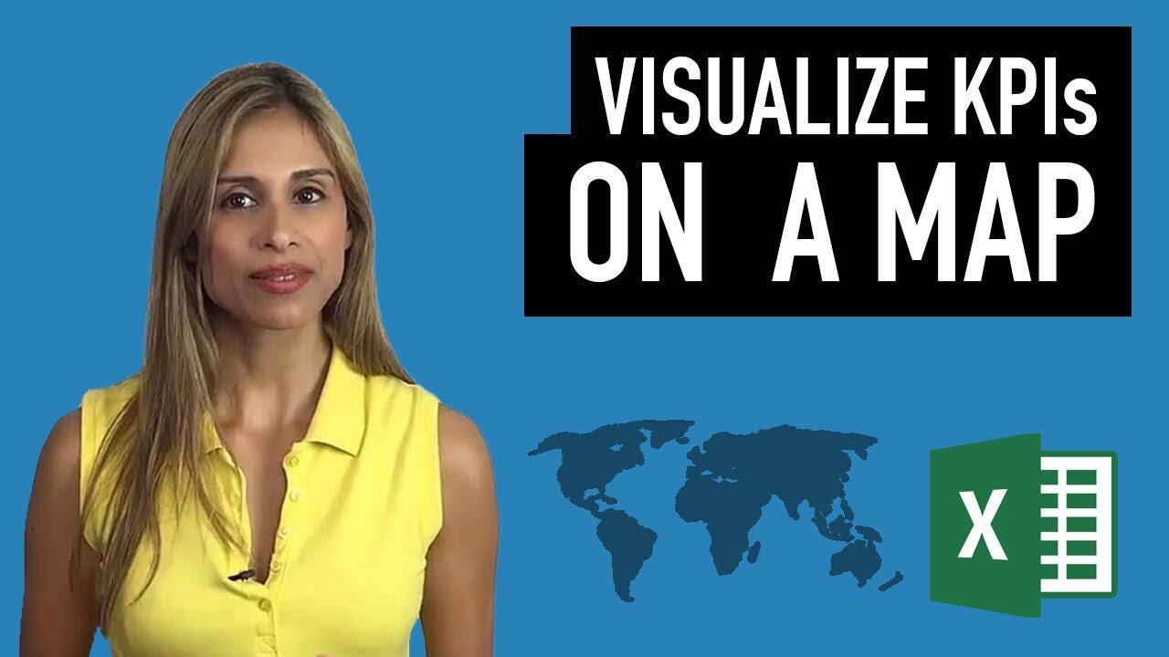
Excel Advanced Charts & Graphs Tutorials: In this lecture you learn how to create a chart that shows your KPI (can be any key figure your are tracking) by geography on a map. The best part is that you can do this on any version of Excel and you can use any map you like. Just make sure you follow these simple steps.
Excel 2016 comes with a new feature called 3D maps. It's a fancy new addition to Excel that allows you to present your data on a map and even create a mini movie out of it. But sometimes a simple 2D graphic is the best messenger. This lecture shows you how you can easily show your values (KPIs) on any map.
★ My Online Excel Courses ► https://courses.xelplus.com
✉ Subscribe & get my TOP 10 Excel formulas e-book for free
https://www.xelplus.com/free-ebook/
EXCEL RESOURCES I Recommend: https://www.xelplus.com/resources/
-
 1:04:43
Crypto Power Hour
9 hours agoPsychology Of Crypto Market Cycles
15.2K6 -
 9:58
9:58
Clintonjaws
12 days ago $0.07 earnedKaroline Leavitt's Response To 'The View' Host's Nasty Attacks Is Perfect
1.96K4 -
 24:23
24:23
World2Briggs
18 hours agoTop 10 Towns You Can Retire on $1900 a month in the Pacific North West.
3.19K3 -
 21:23
21:23
Lady Decade
15 hours ago $0.03 earnedThe Lost Sega Neptune Console Refuses To Die !
2.03K3 -
 17:14
17:14
ThinkStory
20 hours agoIT: WELCOME TO DERRY Episode 2 Breakdown, Theories, & Details You Missed!
4.84K -
 17:25
17:25
Real Estate
1 month agoThe Job Market Collapse IS HERE
3.87K6 -
 LIVE
LIVE
BEK TV
23 hours agoTrent Loos in the Morning - 11/05/2025
187 watching -
 LIVE
LIVE
The Bubba Army
22 hours agoUPS PLANE EXPLODES - What Went Wrong? - Bubba the Love Sponge® Show | 11/05/25
1,746 watching -
 16:38
16:38
James Klüg
20 hours agoFOOD STAMPS RAN OUT, Will People Loot?
19.1K32 -
 23:56
23:56
Producer Michael
18 hours agoBuying My Wife a $500,000 Diamond Necklace!
10.7K10