Responsive Screen Size Breakpoints | Mastering CSS Media Queries for Responsive Web Design | CSS
Responsive Screen Size Breakpoints | Mastering CSS Media Queries for Responsive Web Design | CSS
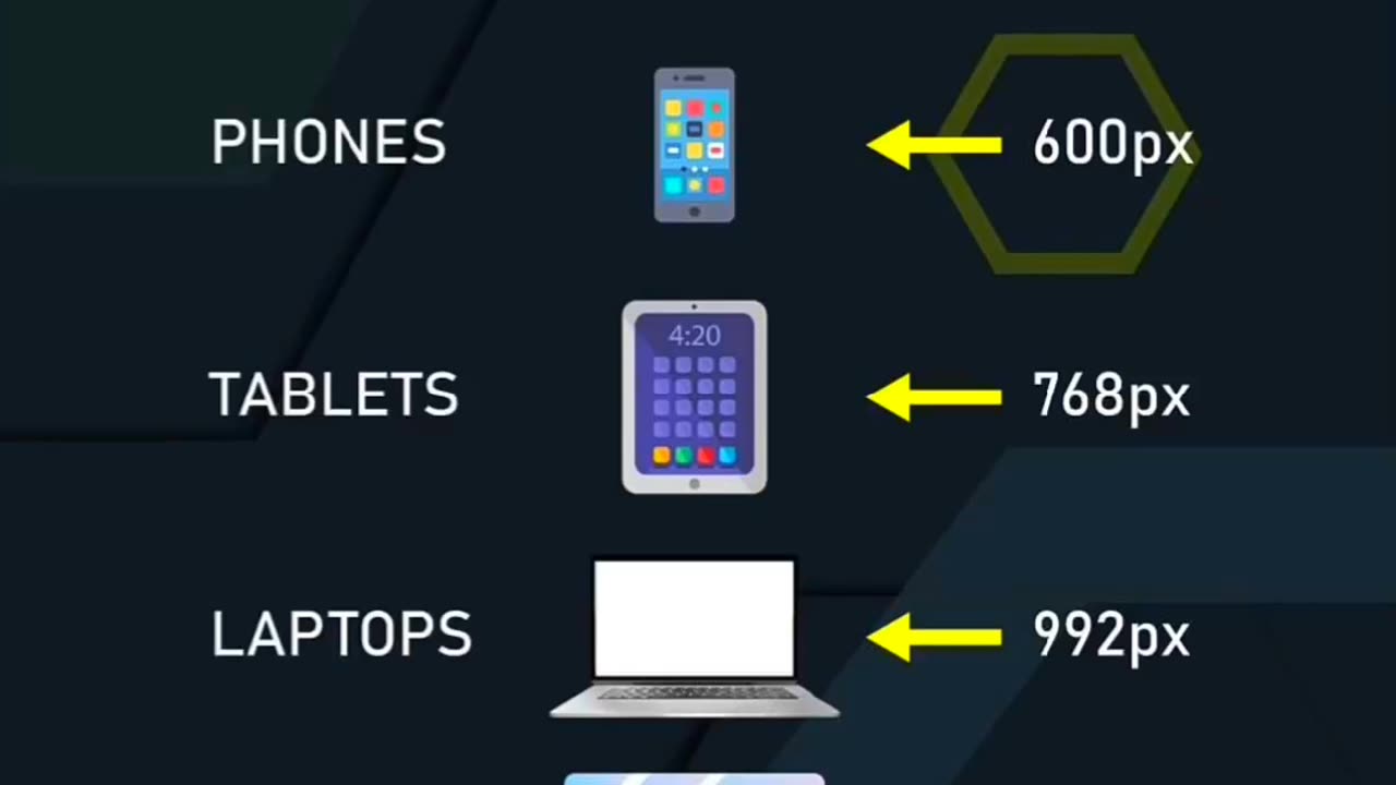
Learn how to create responsive web designs by mastering the concept of screen size breakpoints using CSS media queries. In this tutorial, we'll explore how to adapt your website layout and styling based on different device screen sizes, such as desktops, tablets, and mobile devices. Discover the key principles behind responsive design and how to define breakpoints using CSS media queries. With practical examples and tips, you'll gain the knowledge and skills to make your website look great on any screen, ensuring a seamless user experience across various devices. Join us and unlock the secrets of responsive screen size breakpoints in this comprehensive tutorial.
-
 10:27
10:27
Adam Does Movies
20 hours ago $0.11 earnedShelby Oaks - Movie Review
2.75K7 -
 6:08
6:08
Blackstone Griddles
12 hours agoAlmost Famous French Toast on the Blackstone Camping Griddle
294 -
 LIVE
LIVE
BEK TV
22 hours agoTrent Loos in the Morning - 10/23/2025
152 watching -
 LIVE
LIVE
The Bubba Army
21 hours agoImmigrant Trucker KILLS Again! - Bubba the Love Sponge® Show | 10/23/25
2,455 watching -
 LIVE
LIVE
Side Scrollers Podcast
3 days ago🔴FIRST EVER RUMBLE SUB-A-THON🔴DAY 3🔴WAKE YOUR ASS UP!
1,164 watching -
 19:16
19:16
Jasmin Laine
16 hours agoCBC Gets FACT-CHECKED By Guest—Carney BEGS Poilievre For Help
17.1K14 -
 8:50
8:50
The Shannon Joy Show
14 hours agoBREAKTHROUGH Cancer Treatments With Dr. Makis
2.96K2 -
 9:10
9:10
Faith Frontline
13 hours agoMatthew McConaughey Just Said What No Celebrity Dares to About Jesus
10.2K2 -
 27:03
27:03
Take FiVe - His Glory
1 day agoEp 2112: Sam Anthony: How Citizen Journalism is Replacing Legacy Media | Take Five
14K2 -
 10:01
10:01
Breaking Points
19 hours agoKJP GASLIGHTS On Biden's Age In BONKERS Book Tour
10.8K1