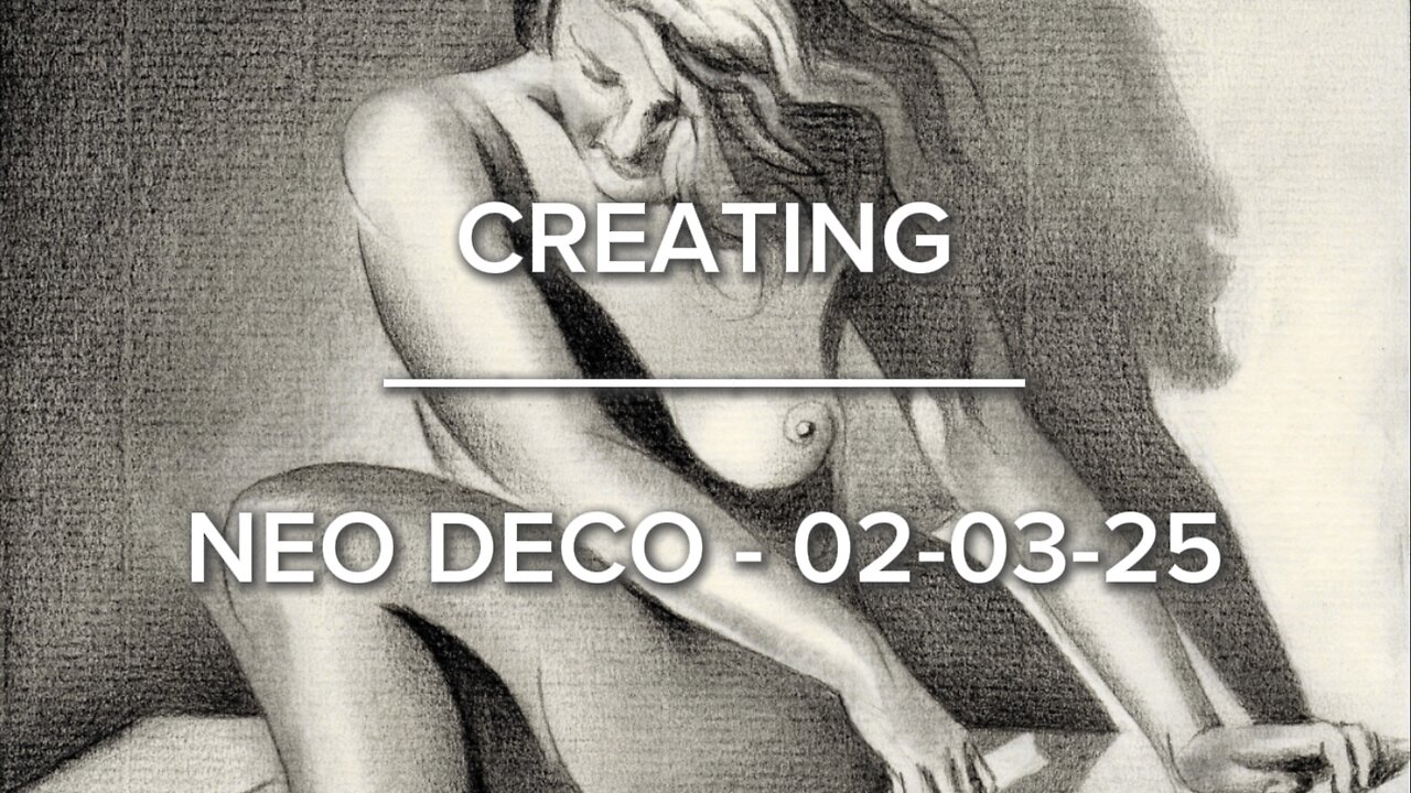
Creating Neo Deco – 02-03-25
Website link: https://corneakkers.com/neo-deco-02-03-25/
Print: https://corneakkers.com/print-neo-deco-02-03-25/
Printable: https://corneakkers.com/product/printable-neo-deco-02-03-25/
Schall
This graphite pencil drawing ‘Neo Deco – 02-03-25’ is inspired by a photograph of Roger Schall. Always loved his work. The model herself could be Assia. Back in the day she posed for many other famous photographers such as Dora Maar. Not sure when this picture was taken. Probably in the mid-1930s. Again, a display of grandeur, class and insight into the depths of composition, rhythym and tonality. Try saying that to contemporary artists. My task I feel it is to honor these artists of old, especially from my beloved Art Deco era.
Changing the Composition
This having said I must admit I did alter the composition a bit by extending the female form. I didn’t like her head cropped in the photo and I wanted to extend the leg a bit. Doing the latter I risked an optical unwanted elongation but I think I managed to keep it plausible. This way I enhanced the overall impression of a triangular pose with a lot of negative space left in the lower right corner. Quite different from my last nude on a stool. Nah, I don’t mind. Life is full of surprizes and sometimes you don’t know which result you are going to get. Initially I planned for a totally different drawing but I forgot to bring along the motif to my studio in Voorburg. Therefor I chose this one on a whim browswing through my folder of artistic motifs I stored.
A Bit Cubist
At first I thought I turn this thing into a heavily abstracted cubist drawing. That’s because I was so inspired by these diagonally placed limbs and the curved cast shadows they created. Setting out the first linear structures and filling those in I came to realize something else. Over time the Ingres paper simply induced me to associate it with impressionism. The grainy structure causes these beautiful broken structures. Either you hate them or you fully embrace them as a caterer of possibilities for subtle tonal shifts. Therefor the cubist styling shows only a little bit. Perhaps it’s due to my latest endeavours to marry cubism to realism. Compared to 10 years ago it’s less abstract. What do you think? Do you like this tendency toward realism more? Personally, I’m not sure. Thinking spherically all the time I love all styles.
Graphite pencil (Faber Castell Pitt Graphite Matt pencil 14B) drawing on Fabriano Ingres paper (21 x 28.2 x 0.1 cm)
Artist: Corné Akkers
-
 0:54
0:54
Corné Akkers Artworks
6 days agoGeesje Kwak – 29-08-21
15 -
 LIVE
LIVE
Sean Unpaved
2 hours agoSam Darnold Will Be FIRST USC QB To START In Super Bowl! | UNPAVED
106 watching -
 57:49
57:49
The Rubin Report
3 hours agoListen to the Fear in Whoopi Goldberg’s Voice on 'The View' as She Gives a Chilling Warning
54.6K41 -
 DVR
DVR
TheAlecLaceShow
2 hours agoTPUSA Halftime Show | Bad Bunny Anti-ICE | Guest: Rep. Wesley Hunt | The Alec Lace Show
4.39K1 -
 LIVE
LIVE
LFA TV
16 hours agoLIVE & BREAKING NEWS! | TUESDAY 2/3/26
2,612 watching -
 1:23:41
MYLUNCHBREAK CHANNEL PAGE
2 hours agoHoover Dam's Hidden Purpose
27.3K2 -
 1:34:31
The Mel K Show
2 hours agoMORNINGS WITH MEL K - STOP FUNDING OUR OWN DEMISE! 2-3-2026
27.4K12 -
 1:31:17
The Shannon Joy Show
3 hours ago🔥SJ LIVE Feb 3 - Congressman Tom Massie On Attempted DOJ Suspension Of Epstein Investigations: NO JUSTICE Till Rich Men Are Perp Walked!!!🔥
15.5K3 -
 42:42
42:42
Grant Stinchfield
2 hours ago $0.39 earnedCHINA’S SHADOW BIO LABS FOUND ON U.S. SOIL... AGAIN!
10.6K8 -
 1:31:49
Graham Allen
5 hours agoDid Epstein Just Win Us The Mid-Terms? NON-WOKE Halftime Show!! + Bongino Army Declares WAR!!
166K455