Create mosaic plot using Python 🧩
4 months ago
6
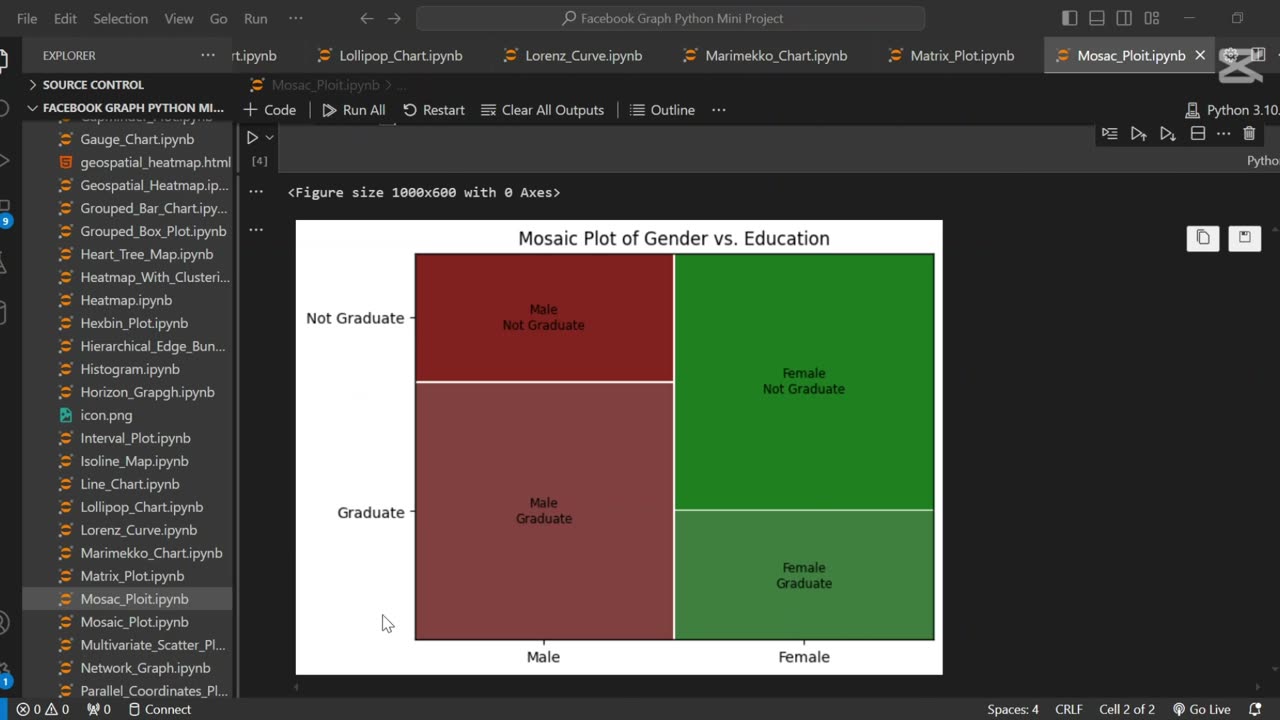
A mosaic plot is a graphical representation of categorical data that visualizes the relationship between two or more variables. 🧩 It displays rectangles whose area is proportional to the frequency of each category combination, making it easy to observe associations and patterns in the data.
In this tutorial, we use Python to generate a mosaic plot using the statsmodels library. We’ll walk through preparing a sample dataset, visualizing categorical relationships (e.g., gender vs. purchase decision), and interpreting the plot. This type of visualization is especially helpful for exploratory data analysis (EDA) and categorical comparison.
Let me know if you’d like a shorter version or a description tailored for a blog, presentation, or report.
Loading comments...
-
 0:17
0:17
AI Evolutionary Technology
17 days agoVisualizing Molecular Structure From SMILES Using RDKit 🧪
1 -
 LIVE
LIVE
LFA TV
2 hours agoLIVE & BREAKING NEWS! | THURSDAY 10/2/25
6,290 watching -
 UPCOMING
Chad Prather
12 hours agoWhen God Delays: Trusting Jesus in the Waiting Room of Life
1K2 -
 LIVE
LIVE
The Chris Salcedo Show
11 hours agoThe Democrat's Schumer Shutdown
758 watching -
 30:32
30:32
Game On!
16 hours ago20,000 Rumble Followers! Thursday Night Football 49ers vs Rams Preview!
1973 -
 1:26
1:26
WildCreatures
14 days ago $0.90 earnedCow fearlessly grazes in crocodile-infested wetland
3.49K2 -
 29:54
29:54
DeVory Darkins
1 day ago $14.43 earnedHegseth drops explosive speech as Democrats painfully meltdown over Trump truth social post
53.4K71 -
 19:39
19:39
James Klüg
1 day agoAnti-Trump Protesters Threaten To Pepper Spray Me For Trying To Have Conversations
15.7K22 -
 34:54
34:54
MattMorseTV
13 hours ago $26.01 earned🔴Trump just FIRED 154,000 FEDERAL WORKERS. 🔴
72.4K96 -
 2:03:32
Side Scrollers Podcast
22 hours agoMASSIVE Netflix Boycott + The TRUTH About Jimmy Kimmel’s Return + BIG Side Scrollers NEWS
35.6K16