Create mosaic plot using Python 🧩
7 months ago
7
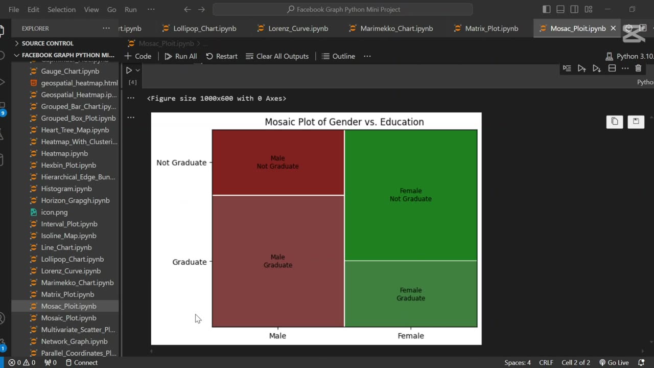
A mosaic plot is a graphical representation of categorical data that visualizes the relationship between two or more variables. 🧩 It displays rectangles whose area is proportional to the frequency of each category combination, making it easy to observe associations and patterns in the data.
In this tutorial, we use Python to generate a mosaic plot using the statsmodels library. We’ll walk through preparing a sample dataset, visualizing categorical relationships (e.g., gender vs. purchase decision), and interpreting the plot. This type of visualization is especially helpful for exploratory data analysis (EDA) and categorical comparison.
Let me know if you’d like a shorter version or a description tailored for a blog, presentation, or report.
Loading comments...
-
 0:16
0:16
AI Evolutionary Technology
2 months agoCreate Email Check Account Services Using Python
9 -
 LIVE
LIVE
DeVory Darkins
38 minutes agoIlhan Omar dealt MAJOR BLOW after CNN host catches her in a lie
16,610 watching -
 1:01:47
Timcast
1 hour agoTrump Orders "Complete Blockade" of Venezuela, Potential Act of WAR
37.5K38 -
 LIVE
LIVE
Steven Crowder
3 hours ago🔴 Vanity Fair's Susie Wiles Hit Piece: Who's To Blame PLUS Special Guest Jillian Michaels
32,485 watching -
 1:17:06
The Rubin Report
2 hours agoLeftist Insults Jillian Michaels on Piers Morgan & It Gets Brutal Fast
22.3K5 -
 LIVE
LIVE
Sean Unpaved
1 hour agoMike McDaniel & Dolphins BENCH Tua Tagovailoa For Quinn Ewers! | UNPAVED
59 watching -
 3:12:33
Misfits Mania
16 hours ago $23.55 earnedANDREW TATE VS CHASE DEMOOR OFFICIAL OPEN WORKOUT
183K20 -
 LIVE
LIVE
LFA TV
16 hours agoLIVE & BREAKING NEWS! | WEDNESDAY 12/17/25
2,676 watching -
 LIVE
LIVE
SternAmerican
23 hours agoFINAL ELECTION INTEGRITY CALL OF 2025 – WEDNESDAY, DECEMBER 17 | 1:00 PM EST
145 watching -
 1:04:41
MYLUNCHBREAK CHANNEL PAGE
2 hours agoA.I. Destroys History
4.62K5