Create mosaic plot using Python 🧩
5 months ago
7
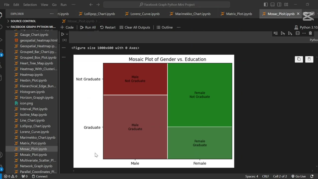
A mosaic plot is a graphical representation of categorical data that visualizes the relationship between two or more variables. 🧩 It displays rectangles whose area is proportional to the frequency of each category combination, making it easy to observe associations and patterns in the data.
In this tutorial, we use Python to generate a mosaic plot using the statsmodels library. We’ll walk through preparing a sample dataset, visualizing categorical relationships (e.g., gender vs. purchase decision), and interpreting the plot. This type of visualization is especially helpful for exploratory data analysis (EDA) and categorical comparison.
Let me know if you’d like a shorter version or a description tailored for a blog, presentation, or report.
Loading comments...
-
 0:18
0:18
AI Evolutionary Technology
26 days ago💰 Simple Currency Converter App in Python
19 -
 15:09
15:09
BlackDiamondGunsandGear
8 hours agoTop 5 Pistols UNDER $400
1322 -
 8:31
8:31
Hollywood Exposed
11 hours agoJoe Rogan Just EXPOSED Who’s REALLY Behind the “No Kings” Protests
491 -
 34:29
34:29
Uncommon Sense In Current Times
14 hours agoFaith at Work | Mike Sharrow on Living Boldly for Christ in Business
42 -
 7:37
7:37
The Shannon Joy Show
12 hours agoThe U.S. Economy is in SHAMBLES.
5527 -
 48:03
48:03
Coin Stories with Natalie Brunell
18 hours agoChristianity and Bitcoin: Why ‘You Shall Not Steal’ Demands Hard Money Not Fiat
1263 -
 22:38
22:38
Professor Nez
16 hours agoI've NEVER Seen Tucker Carlson like THIS...
2.2K6 -
 13:43
13:43
Actual Justice Warrior
1 day agoHomeless Psycho Tries To KILL Massage Workers
11.7K8 -
 15:46
15:46
BlaireWhite
1 day agoNetflix's LGBTQ Kids Content Is Hot Trash.
13K6 -
 36:54
36:54
Comedy Dynamics
5 days ago5 Spooky Moments from Jeff Dunham: Minding the Monsters
14.3K2