Create mosaic plot using Python 🧩
3 months ago
6
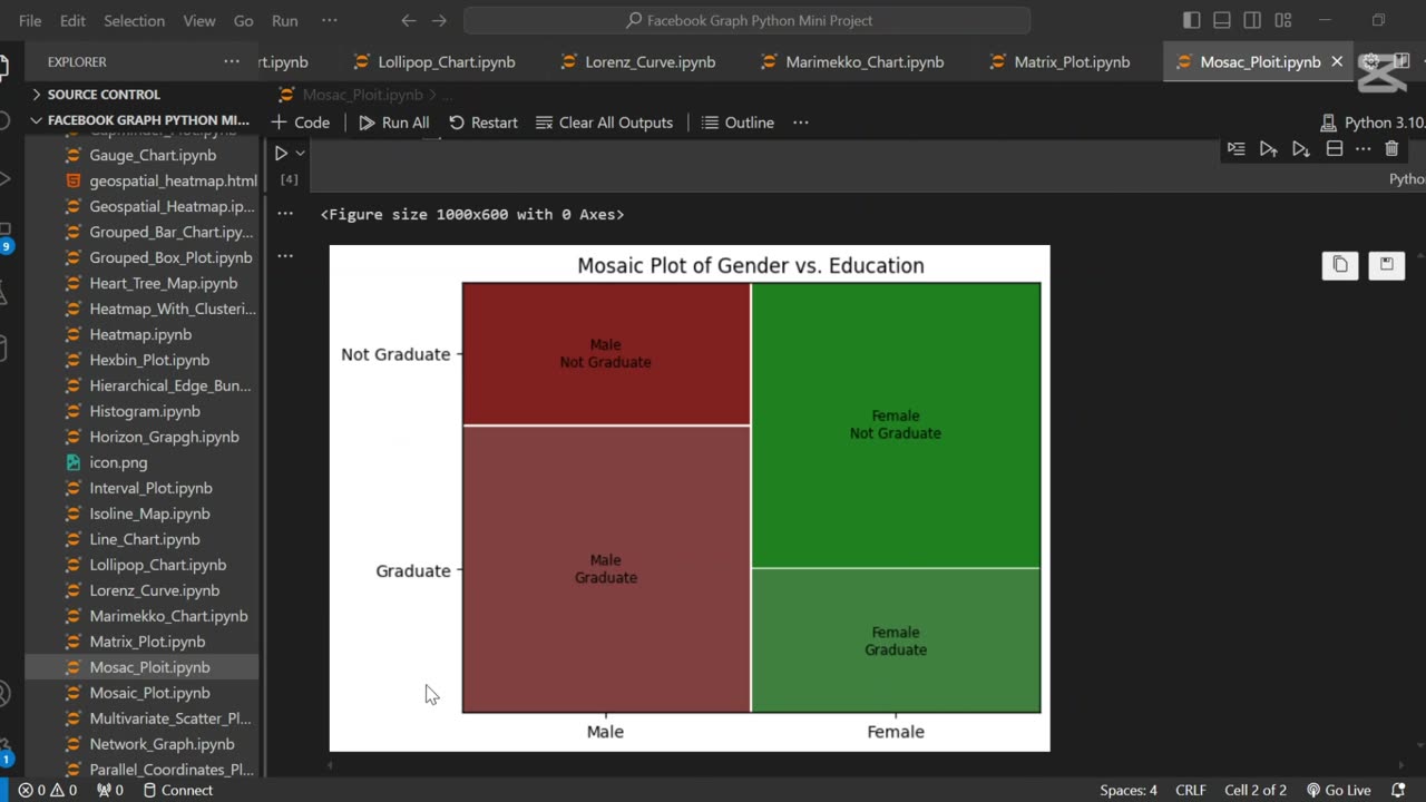
A mosaic plot is a graphical representation of categorical data that visualizes the relationship between two or more variables. 🧩 It displays rectangles whose area is proportional to the frequency of each category combination, making it easy to observe associations and patterns in the data.
In this tutorial, we use Python to generate a mosaic plot using the statsmodels library. We’ll walk through preparing a sample dataset, visualizing categorical relationships (e.g., gender vs. purchase decision), and interpreting the plot. This type of visualization is especially helpful for exploratory data analysis (EDA) and categorical comparison.
Let me know if you’d like a shorter version or a description tailored for a blog, presentation, or report.
Loading comments...
-
 1:06
1:06
AI Evolutionary Technology
3 days agoAdd Stunning Colors to Your Python Console | Text Styling Made Easy
7 -
 2:57:44
The Charlie Kirk Show
3 hours agoWASHINGTON D.C. PRAYER VIGIL FOR CHARLIE KIRK
82K120 -
 1:29:23
Nerdrotic
4 hours ago $2.70 earnedThe Turning Point | New UFO Video with Michael Collins | Forbidden Frontier #117
17.6K3 -
 LIVE
LIVE
Sarah Westall
1 hour agoSuicide Pacts forming in Youth Social Media Groups - Discord, Reddit, TikTok w/ John Anthony
503 watching -
 2:25:31
vivafrei
11 hours agoEp. 281: Charlie Kirk; Routh Trial; Charlotte Train; Bolsanaro Defense; SCOTUS & MORE!
72.5K88 -
 2:55:38
Turning Point USA
3 hours agoWASHINGTON D.C. PRAYER VIGIL FOR CHARLIE KIRK
24.8K12 -

The Mel K Show
3 hours agoMel K & Tim James | Healing is an Inside Job | 9-14-25
6.07K1 -
 LIVE
LIVE
IsaiahLCarter
6 hours agoCharlie Kirk, American Martyr (with Mikale Olson) || APOSTATE RADIO 028
361 watching -
 16:43
16:43
Mrgunsngear
9 hours ago $0.80 earnedKimber 2K11 Pro Review 🇺🇸
2.77K10 -
 13:40
13:40
Michael Button
1 day ago $0.17 earnedThe Strangest Theory of Human Evolution
4487