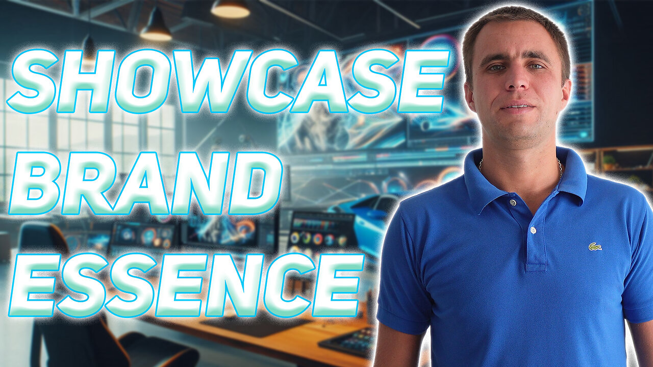
Turning Brand Guidelines into Motion Ads that sell
You’ve got a logo that slaps, fonts that scream sophistication (or rebellion—no judgment), and a color palette curated like a Michelin-star menu.
Then your motion designer delivers your first animated ad…
And it looks like it was made in a haunted version of PowerPoint.
The colors? Wrong. The fonts? Random. The logo? There… somewhere… possibly behind a spinning cube?
That, my friends, is what we call a **“brand ghosting.”**
And it happens *way* more often than it should.
---
1. Brand Identity Isn’t Optional — It’s Your Business Suit in Public.**
Here’s the truth: your logo, fonts, and brand colors aren’t just “design stuff.” They’re *nonverbal salespeople*.
Would you wear Crocs with a tux to a job interview? No? Then don’t put comic sans on your minimalist luxury brand explainer.
**Case Study:**
A skincare brand had a gorgeous neutral-toned identity—earthy beiges, soft greens, serif fonts that whispered “expensive.” But their animated ad? Neon pinks, funky fonts, and a soundtrack that sounded like a retro video game on speed.
Result? *Viewer drop-off in under 3 seconds.*
After redesigning with brand colors, soft UI movements, and the brand’s actual logo elegantly animated in the intro and outro… engagement jumped 67%, and people *finally* remembered the brand name.
---
2. Motion Design is Branding in Action. Literally.**
Think of motion design as your brand on a stage, under a spotlight, and with 10 seconds to impress a hyper-scrolling, coffee-fueled audience.
Every pixel needs to whisper your story.
Every transition must echo your values.
Every second is a branding opportunity—or a branding fail.
**Anecdote:**
One SaaS company we worked with said, “Just make it pop.”
We said, “Sure. Want us to randomly pick your wedding outfit too?”
(They laughed nervously.)
We showed them two versions: one generic template, and one using their actual typeface, branded accent colors, and a sleek logo animation. Guess which one converted *5x more* leads?
Yup—the one that looked like it *belonged to them*.
---
*3. Fonts Are the Voice, Colors Are the Mood, Logos Are the Signature.**
Imagine watching a heartfelt brand ad…
The visuals are cinematic, the music emotional, the pacing perfect—
…then suddenly, the CTA shows up in Comic Sans.
It’s like watching Shakespeare… then being hit with a pie to the face.
**Fact:** Fonts are emotional.
Colors are psychological.
Logos are trust signals.
If your motion design ignores them, your audience won’t just be confused—they’ll *bounce*.
**Search Trend Tip:**
According to Google Trends, “brand color psychology” and “font impact in advertising” have shown consistent interest spikes—especially in ad design forums and creative subreddits. People *want* to know how these elements affect perception. (*Spoiler: A lot.*)
---
## 💡 **4. Integrated Branding = Unforgettable Impressions**
People don’t remember ads that blend in. They remember the ones that *feel like a story they’ve seen before—but shinier, smoother, and somehow more animated*.
That’s the power of branding integration:
* Your font becomes a tone.
* Your logo becomes a stamp.
* Your color palette becomes a *vibe*.
And when all three work together in motion design?
You don’t just create ads.
You create **brand recall**.
---
“If it ain’t *your* brand, it ain’t *the* ad.”**
Look—your brand isn’t IKEA furniture. We don’t build it with random parts and hope it stands.
It’s your personality. It’s your voice.
So when someone asks:
> “Can you integrate my brand colors, logo, and fonts into the motion design?”
The only acceptable answer is:
**“Can we? That’s the only way we do it.”**
Because otherwise… you’re just animating noise.
---
**🎁 Want your motion ad to actually *look* and *feel* like your brand?**
Let’s make your fonts glide, your colors pop (on-brand, of course), and your logo shine like it belongs on the Oscars red carpet.
-
 LIVE
LIVE
The Jimmy Dore Show
59 minutes agoEmmy Winners DEMAND Israel Stop the Genocide! Charlie Kirk’s LAST INTERVIEW Before His Death!
4,018 watching -
 LIVE
LIVE
The Nick DiPaolo Show Channel
3 hours agoKirk Assassination Exposes Insane Left | The Nick Di Paolo Show #1793
2,579 watching -
 LIVE
LIVE
The Mike Schwartz Show
2 hours agoTHE MIKE SCHWARTZ SHOW Evening Edition 09-15-2025
66 watching -
 LIVE
LIVE
Quite Frankly
5 hours agoStaggering Evil, Official Stories & Open Lines | Rich Baris 9/15/25
134 watching -
 1:09:33
TheCrucible
3 hours agoThe Extravaganza! EP: 36 (9/15/25)
131K7 -
 1:13:06
Candace Show Podcast
2 hours agoThey Are Lying About Charlie Kirk. | Candace Ep 235
37.2K141 -
 DVR
DVR
Kim Iversen
2 hours agoWas There a Second Shooter in the Charlie Kirk Attack?
25.7K28 -
 DVR
DVR
Redacted News
3 hours ago“They’re NOT stopping with Charlie Kirk!” JD Vance TORCHES violent leftists | Redacted
206K75 -
 39:45
39:45
Kimberly Guilfoyle
2 hours agoCharlie's Legacy and Our Mission | Ep.253
30.9K11 -
 10:06
10:06
Tundra Tactical
3 hours agoWhats The Deal With New Guns In 2025 Part 2
5.96K