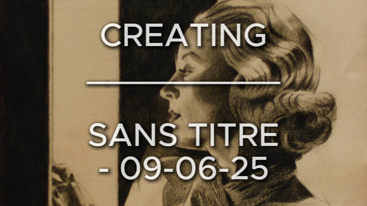
Creating Sans Titre – 09-06-25 (Carole Lombard)
Website link: https://corneakkers.com/sans-titre-09-06-25-carole-lombard/
Print: https://corneakkers.com/print-sans-titre-09-06-25-carole-lombard/
Printable: https://corneakkers.com/product/printable-sans-titre-09-06-25-carole-lombard/
Another Carole
This graphite pencil drawing ‘Sans Titre – 09-06-25’ revisits American celebrity and moviestar Carole Lombard. More art deco-ish and less cubist, I guess. As to this one the amount of cubism is showing only mildly. That’s due to the usage of heavy chiaroscuro tones. Consequently there was little room for showing harsh and straight lines. Contour delineations were already blackened so many lines were incorporated into a perfect darkness. However, it still shows as a certain trademark personal to me. Which I came to call ‘Neo Deco’. That is because I think cubism is not the only aspect of this style I developed throughout the years.
Hollywood Photographer
Not the first time I drew her. Last time was in february of this year. Also on Ingres (Fabriano) and now on Hahnemühle’s. Perhaps I was just wondering how she would look like on this sort of paper. Ingres paper still is a favorite and a perfect reference picture I found was the inspirational source for this drawing. Which is Clarence Sinclair Bull’s by the way, a famous Hollywood photographer back in the day. So, thanks and respect to him. I simply adore those portrait side views and the reason for that is simple. These 1930s hairdos are nothing more than smashing pieces of art. Not even trying to imagine how much work have been put into these lush curly hairdos! They are perfect to cubist style them though. In Carole’s case there was a great tonal rhythym of white and dark areas cascading down her hair.
Glamour Attire?
She had this typical 1930s glamour attire on which I found incredibly difficult to capture. It resembles a sort of crocodile leather. A first attempt looked to dominant. Therefor I tuned it down a bit. The lower part of the drawing I kept quit simple. A bit of styling here and there and getting the tones and proportions right. The value added is all in the hair I see. A great little drawing in between, waiting for my oil in progress to become dry.
Pitt Graphite Matt pencil (Faber-Castell) drawing on Hahnenmühle Ingres paper (24 x 31 x 0.1 cm)
Artist: Corné Akkers
-
 0:29
0:29
Corné Akkers Artworks
5 days agoModel Session – 18-10-25 – 2
22 -
 5:14:08
BBQPenguin_
5 hours agoARC RAIDERS LIVE: High-Stakes Extraction & PvPvE! (First Run)
511 -
 9:53
9:53
Rethinking the Dollar
20 hours agoWhen Detroit Bleeds, America Suffer! Layoffs Have Begun
1.52K5 -
 18:36
18:36
Clownfish TV
22 hours agoYouTube Just NERFED YouTube Gaming... | Clownfish TV
2.43K12 -
 10:26
10:26
Silver Dragons
17 hours agoSilver is TAKING OFF Around the World
2.51K3 -
 1:36
1:36
From Zero → Viral with AI
1 day agoAI in Content Creation & Discovery – The New Era of Marketing
1.3K -
 1:20:10
FreshandFit
11 hours agoMiami Halloween Street Debate
204K100 -
 2:06:16
TimcastIRL
14 hours agoTrump Calls For NUCLEAR OPTION, END Filibuster Over Food Stamp Crisis | Timcast IRL
216K176 -
 3:58:54
SavageJayGatsby
12 hours ago🎃 Friend Friday – Halloween Edition! 👻🕷️
52.1K4 -
 16:16
16:16
Robbi On The Record
12 days ago $22.02 earnedThe Dark History of Halloween | What You Should Know
69.4K70