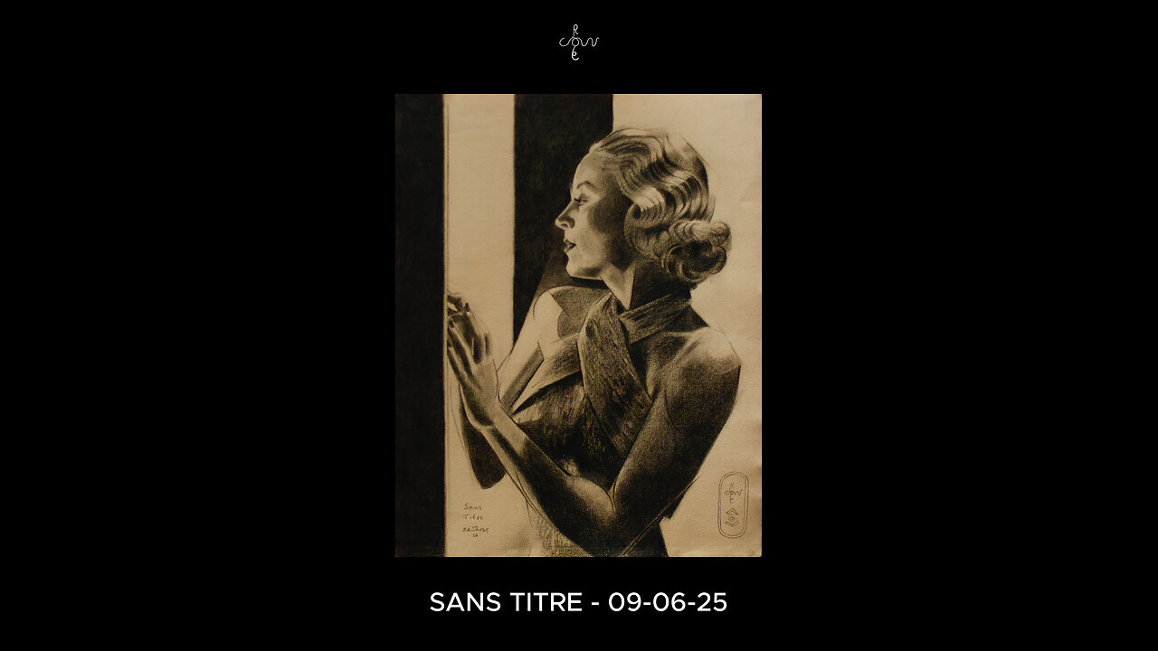
Sans Titre – 09-06-25 (Carole Lombard)
Website link: https://corneakkers.com/sans-titre-09-06-25-carole-lombard/
Print: https://corneakkers.com/print-sans-titre-09-06-25-carole-lombard/
Printable: https://corneakkers.com/product/printable-sans-titre-09-06-25-carole-lombard/
Another Carole
This graphite pencil drawing ‘Sans Titre – 09-06-25’ revisits American celebrity and moviestar Carole Lombard. More art deco-ish and less cubist, I guess. As to this one the amount of cubism is showing only mildly. That’s due to the usage of heavy chiaroscuro tones. Consequently there was little room for showing harsh and straight lines. Contour delineations were already blackened so many lines were incorporated into a perfect darkness. However, it still shows as a certain trademark personal to me. Which I came to call ‘Neo Deco’. That is because I think cubism is not the only aspect of this style I developed throughout the years.
Hollywood Photographer
Not the first time I drew her. Last time was in february of this year. Also on Ingres (Fabriano) and now on Hahnemühle’s. Perhaps I was just wondering how she would look like on this sort of paper. Ingres paper still is a favorite and a perfect reference picture I found was the inspirational source for this drawing. Which is Clarence Sinclair Bull’s by the way, a famous Hollywood photographer back in the day. So, thanks and respect to him. I simply adore those portrait side views and the reason for that is simple. These 1930s hairdos are nothing more than smashing pieces of art. Not even trying to imagine how much work have been put into these lush curly hairdos! They are perfect to cubist style them though. In Carole’s case there was a great tonal rhythym of white and dark areas cascading down her hair.
Glamour Attire?
She had this typical 1930s glamour attire on which I found incredibly difficult to capture. It resembles a sort of crocodile leather. A first attempt looked to dominant. Therefor I tuned it down a bit. The lower part of the drawing I kept quit simple. A bit of styling here and there and getting the tones and proportions right. The value added is all in the hair I see. A great little drawing in between, waiting for my oil in progress to become dry.
Pitt Graphite Matt pencil (Faber-Castell) drawing on Hahnenmühle Ingres paper (24 x 31 x 0.1 cm)
Artist: Corné Akkers
-
 0:34
0:34
Corné Akkers Artworks
17 days agoRoundism – 04-06-18
131 -
 2:04:41
MG Show
23 hours agoJames 'Dirty Cop' Comey Indicted; A Plan to Starve the American People
53.5K21 -
 9:11
9:11
MattMorseTV
19 hours ago $19.42 earnedVance just DROPPED the HAMMER.
139K85 -
 10:16
10:16
GritsGG
19 hours agoBEST Controller Settings for Warzone! Rank 1 Player's Settings!
41.8K4 -
 2:13:30
Side Scrollers Podcast
1 day agoUK Introduces MANDATORY Digital ID + Dallas ICE Shooting BLAMED on Gaming + More | Side Scrollers
163K24 -
 10:34
10:34
The Pascal Show
18 hours ago $7.39 earnedFOOTAGE REVEALED! Images Of Celeste Rivas Exposed Before Her Disappearance From Home Running To D4vd
53.3K3 -
 LIVE
LIVE
Lofi Girl
2 years agoSynthwave Radio 🌌 - beats to chill/game to
283 watching -
 4:23:47
MissesMaam
13 hours ago*Spicy* Friend Friday with Mally_Mouse and Friends!! 💚✨
328K19 -
 2:05:09
TimcastIRL
14 hours agoRIOTS Leftist ATTACK ICE, Tear Gas Deployed, Feds Ordered To IGNORE CA Law, CIVIL WAR! | Timcast IRL
367K338 -
 15:57
15:57
Robbi On The Record
1 day ago $9.76 earnedTranshumanism: Are Humans Becoming Obsolete? Neuralink & CRISPR explained
67K27