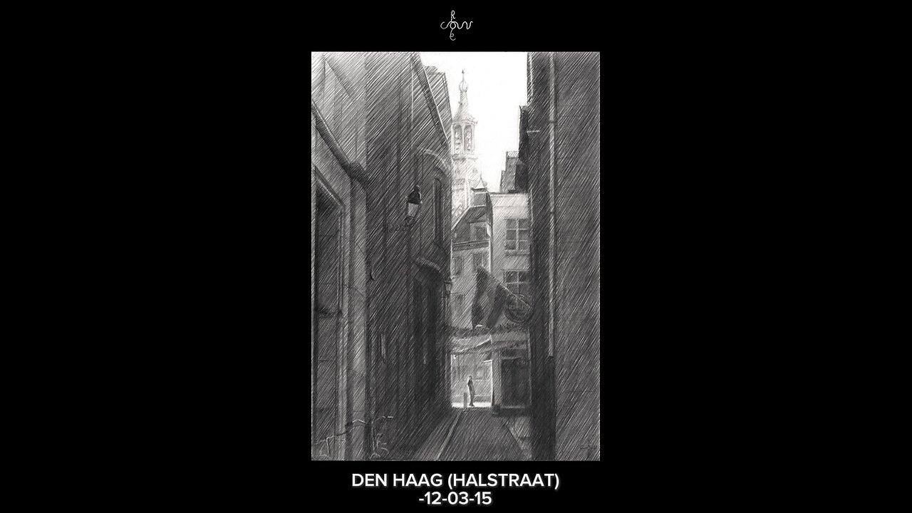
The Hague (Halstraat) - 12-03-15
Website link: https://corneakkers.com/the-hague-halstraat-12-03-15/
Print: https://corneakkers.com/print-the-hague-halstraat-12-03-15/
Printable: https://corneakkers.com/product/printable-the-hague-halstraat-12-03-15/
Nothing Particular
This graphite pencil drawing ‘The Hague – 12-03-15 offers an impressionist view on the Halstraat. It’s a small street in the centre of The Hague, Netherlands. One time I came across this street and I was instantly fascinated by the blocked-in light column. The street displays lots of depth in front and back to the St. Jacob’s Church in the background. However, nothing particular is there to be found and it used to be the back of the Maison de Bonneterie. Netherless am I attracted to this kind of back streets and alleys. That’s because of the imtimate, almost tucked away character they ooze out. It is almost like they need to be noticed too.
No Baudelaire Needed
There are plenty shopping streets with agressive demonstrations of advertisement. Not my cup of tea for artists like me. As to this I do not concurr with Baudelaire’s cry to portray daily life. Nowadays such is dominated by logo’s of retail chains and franchised stores. But hey, I am off topic now. I’d better accentuate the positive.
Inspirational Source
The drawing was directly influenced by my admiration for Gerrit Berckheyde’s oil painting ‘Gezicht op de Gouden Bocht’ of 1671-1672. He depicted some empty slots in Amsterdam’s most prestigeous part of the Herengracht, the so-called ‘Golden Bend’. It is not the invention of something great but rather the recognition of the tonal rhythym (light-dark-light-dark). Personally I think only great artist can see the implicite order behind matter. Others only will see houses and empty space between them where nothing has been built yet.
One Single Horizontal Beam
Another thing I was attracted to was the horizontal stripe of light in the back on the pavement of the Hoogstraat. The light is low in quantity but high in quality because it stands out amidst dark tones around it. Thus the horizontal is in balance with the verticals. I like balancing out these qualitative and quantitative aspects in a work.
Graphite pencil drawing (Pentel 0.5 mm, 3B) on Canson Bristol paper (21 x 29.7 x 0.1 cm - A4 format)
Artist: Corné Akkers
-
 1:13
1:13
Corné Akkers Artworks
2 days agoCreating Neo Deco - 24-09-25
29 -
 1:40:32
Redacted News
2 hours ago"This was 100% a CIA hit!" Charlie Kirk's Assassination Story COLLAPSES Amid New Evidence | Redacted
88.1K76 -
 39:40
39:40
The White House
3 hours agoPresident Trump Signs Executive Orders, Sep. 30, 2025
19.1K21 -
 1:06:26
vivafrei
3 hours agoLive with Alexa Lavoie! ANTIFA in Canadian Government? RCMP the New Gestapo? AND MORE!
128K35 -
 40:38
40:38
Dad Saves America
23 hours agoLeft Is Right, Up Is Down: The Overton Window Has Been Shattered
5.52K -
 LIVE
LIVE
LFA TV
18 hours agoBREAKING NEWS ALL DAY! | TUESDAY 9/30/25
1,123 watching -
 LIVE
LIVE
freecastle
6 hours agoTAKE UP YOUR CROSS- May the forces of evil become confused on the way to your house.
238 watching -
 1:23:05
Awaken With JP
5 hours agoGetting NUTS! FBI Did J6, Comey Indicted, and More! - LIES ep 110
55K25 -
 2:09:51
Pop Culture Crisis
3 hours agoJK Rowling OBLITERATES Emma Watson, Trump Vs Ariana Grande, Could The Rock be President? | Ep. 926
40.2K7 -
 1:46:23
The HotSeat
2 hours agoCommander In Chief and SECWAR Address The Troops, and I AM HERE FOR IT!
19.7K13