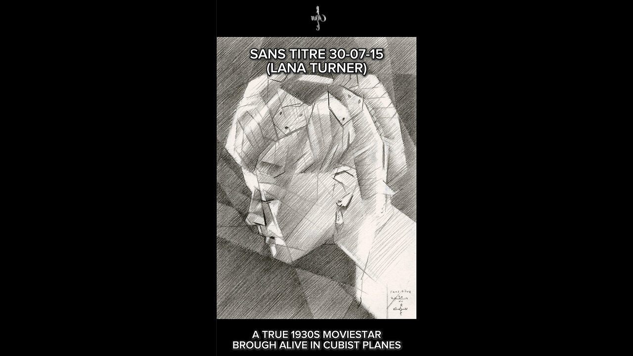
Sans titre - 30-07-14
Website: https://corneakkers.com/sans-titre-30-07-14/
Print: https://corneakkers.com/print-sans-titre-30-07-14-lana-turner/
Printable: https://corneakkers.com/product/printable-sans-titre-30-07-14-lana-turner/
Some Darker Tones
This graphite pencil drawing ‘Sans Titre – 30-07-14’ depics American moviestar and celebrity Lana Turner. I used a still from a movie from the 1930s. Yesterday’s drawing was a nude. Now it’s time for something else and I thought I’d extend my Sans Titre series. Last celebrity I drew was Shirley Maclaine in the beginning of this month. Even though the resemblance was accurate I thought it was a bit weak tonally. This time I had it in me to crank up tones even more. See what that might bring me. Not too much but hatching more denser black strokes in the negative space. This way I could carve out the head and let it contrast dramatically. That’s why I like Lauren’s Bacall’s portrait I made a couple of months back better.
Unexpected Sides
Best know for her roles as femme fatale and blonde bombshell she also played some interesting serious ones. Of course there were personal struggles and bad relationships. Personally I don’t like the glam of it all. Even though I’m an Art Deco grandure style kind of guy I usually pick out atypical pictures of moviestars. Just like I did with Marilyn Monroe, discovering softer and unexpected sides of actresses. The reference picture I used for this one was a still from an early movie starring her as leading lady.
Matching Tones and Cubes
What attracted me were the endless possibilities to cubistically style her hairdo into nothing but straight planes. Even the hairnet was fun to do. Because she leaned over to her male opponent her eyes are positioned incredibly low in the overall portrait. However, in her facial features there was a lot of chiaroscuro going on. A bit of balancing on a tight rope. One simply can either make the hairdo to striking or facial features. Only for them to appear ‘separated’ in some sort of way. This having said, I thing I did a mighty fine job having both part correspond both cubistically and tonally. Hence, there is balance and unity.
Graphite pencil drawing (Pentel 0.5 mm, 3B) on Winsor & Newton paper (14.8 x 21 x 0.1 cm – A5 format)
Artist: Corné Akkers
-
 0:57
0:57
Corné Akkers Artworks
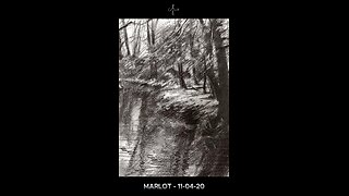
1 day agoMarlot - 11-04-20
35 -
 25:55
25:55
Welker Farms
16 hours ago $0.08 earnedI'd Say We Make A Pretty Good Team Fix'n These Tractors
861 -
 8:01
8:01
Gun Owners Of America
14 hours ago40+ Members of Congress Warn DOJ & ATF To Stop Defending the NFA!
2841 -
 LIVE
LIVE
BEK TV
22 hours agoTrent Loos in the Morning - 12/19/2025
200 watching -
 18:47
18:47
stateofdaniel
2 days agoJD Vance DESTROYS Twisted Vanity Fair HIT PIECE Against President Trump and Susie Wiles
26.8K19 -
 15:42
15:42
Actual Justice Warrior
1 day agoWealthy New Jersey School District Goes BROKE Overnight
14.8K19 -
 29:15
29:15
James Klüg
1 day agoI Crashed An ANTI-ICE March In Portland
27.6K26 -
 45:40
45:40
Surviving The Survivor: #BestGuests in True Crime
17 hours agoLIVE Hearing: Kentucky Sheriff Mickey Stines Back in Court; Murder of Judge Kevin Mullins
15.5K1 -
 1:17:00
Man in America
14 hours ago6G Is Coming — And Your Body Will Be Part of the AI-Run Network w/ Kim Bright
300K77 -
 1:32:57
Inverted World Live
13 hours agoAttack of the Radioactive Fog in L.A. | Ep. 156
91K12