Excel 2021 In Practice - Ch 3 Guided Project 3-3 - Blue Lake Sporting Goods (Update in 2025)
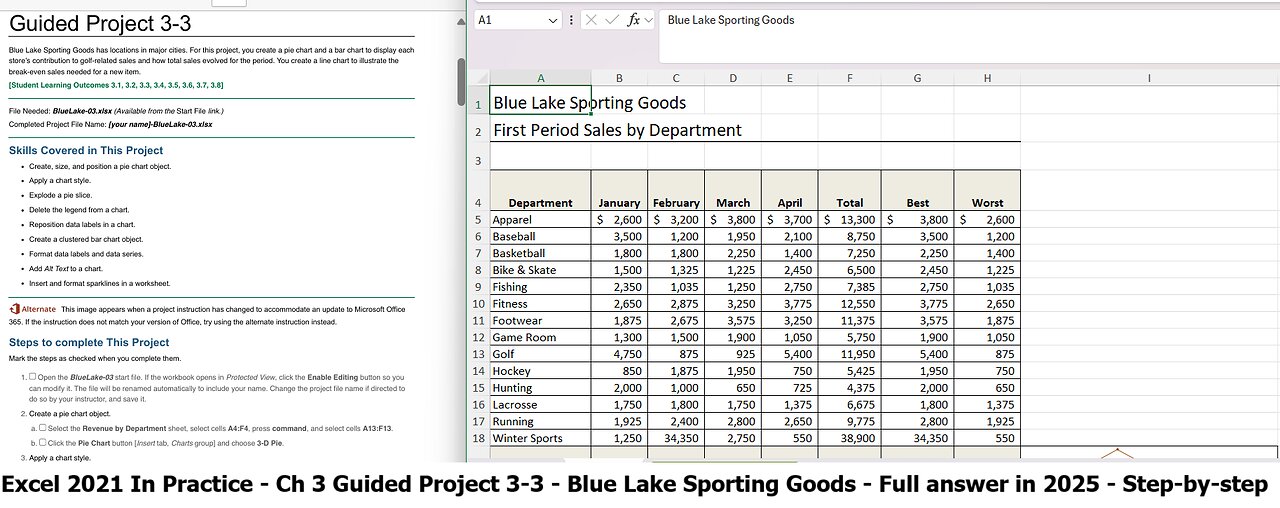
Guided Project 3-3
Blue Lake Sporting Goods has locations in major cities. For this project, you create a pie chart and a bar chart to display each
store’s contribution to golf-related sales and how total sales evolved for the period. You create a line chart to illustrate the
break-even sales needed for a new item.
[Student Learning Outcomes 3.1, 3.2, 3.3, 3.4, 3.5, 3.6, 3.7, 3.8]
File Needed: BlueLake-03.xlsx (Available from the Start File link.)
Completed Project File Name: [your name]-BlueLake-03.xlsx
Skills Covered in This Project
Create, size, and position a pie chart object.
Apply a chart style.
Explode a pie slice.
Delete the legend from a chart.
Reposition data labels in a chart.
Create a clustered bar chart object.
Format data labels and data series.
Add Alt Text to a chart.
Insert and format sparklines in a worksheet.
This image appears when a project instruction has changed to accommodate an update to Microsoft Office
365. If the instruction does not match your version of Office, try using the alternate instruction instead.
Steps to complete This Project
Mark the steps as checked when you complete them.
1. Open the BlueLake-03 start file. If the workbook opens in Protected View, click the Enable Editing button so you
can modify it. The file will be renamed automatically to include your name. Change the project file name if directed to
do so by your instructor, and save it.
2. Create a pie chart object.
a.
b.
Select the Revenue by Department sheet, select cells A4:F4, press command, and select cells A13:F13.
Click the Pie Chart button [Insert tab, Charts group] and choose 3-D Pie.
3. Apply a chart style.
a.
b.
c.
Select the chart object if necessary.
Click the More button [Chart Design tab, Chart Styles group].
Select Style 3.
4. Size and position a chart object.
a.
b.
c.
Point to the chart object border to display the move pointer.
Drag the chart object so its top-left corner is at cell H4.
Point to the bottom right selection handle to display the resize arrow.
1/5
https://sdsu.simnetonline.com/sp/assignments/projects/details/10431045
8/2/25, 9:13 AM
Drag the pointer to reach cell Q19.
Excel 2021 In Practice - Ch 3 Guided Project 3-3 - SIMnet
d.
5. Explode a pie slice.
a.
b.
c.
d.
e.
Double-click the pie to open its Format Data Series task pane.
Click the San Diego slice to update the pane to the Format Data Point task pane. (Rest the pointer on a slice
to see its identifying ScreenTip or refer to the legend.)
Click the Series Options button in the Format Data Point task pane.
Set the pie explosion percentage at 10%.
Close the task pane and click the chart object border to deselect the San Diego slice.
6. Display and format data labels.
a.
b.
c.
d.
e.
f.
g.
Click the Add Chart Element button [Chart Design tab, Chart Layouts group], and point to Data Labels to
open its submenu, and choose More Data Label Options....
Verify that the Label Options group is selected in the Format Data Labels pane.
Click Label Options to expand the group if it is collapsed.
Select the Category Name box.
Confirm that the Percentage and the Show Leader Lines boxes are selected (
Figure 3-80 Format Data Labels task pane
Click the Separator drop-down list and choose (space).
Figure 3-80).
Click the Fill & Line button, expand the Fill group, and select No Fill. This removes the black background box
for each label.
h. Close the task pane.
7. Delete the legend and recolor and position data labels.
a.
b.
c.
d.
e.
f.
g.
Select the legend.
Confirm your selection in the Chart Elements drop-down list [Format tab, Current Selection group].
Press Delete to remove the legend.
Click the Chart Elements drop-down list [Format tab, Current Selection group] and select Series “Golf” Data
Labels. All of the city names and percentages are selected.
Click the Text Fill button [Format tab, WordArt Styles group] and choose Black, Text 1 (second column).
Click as many times as needed to select only the San Diego data label.
Point to display a move pointer and drag the label as shown in
Figure 3-81.
2/5
https://sdsu.simnetonline.com/sp/assignments/projects/details/10431045
8/2/25, 9:13 AM
Excel 2021 In Practice - Ch 3 Guided Project 3-3 - SIMnet
Figure 3-81 Data labels positioned by dragging each one
h.
i.
Select each data label and position it as shown in the figure. If you accidentally move another element, press
command+Z to undo the error.
Click a worksheet cell.
8. Create a clustered bar chart object to simulate a funnel chart.
a. Select cells A22:B26.
b.
c.
Click the Insert tab and click the Recommended Charts button [Charts group] to display the options.
Scroll down to and click the Clustered bar option (
Figure 3-82 Mac).
Figure 3-82 Mac Clustered Bar chart suggested based on the data
9. Size and position a clustered bar chart object.
a.
b.
c.
d.
Point to the chart object border to display the move pointer.
Drag the bar chart object so its top-left corner is at cell C21.
Point to the bottom right selection handle to display the resize arrow.
Drag the pointer to reach cell L40 (Figure 3-82).
10. Apply a chart style.
a.
b.
c.
Confirm that the bar chart object is selected.
Click the More button [Chart Design tab, Chart Styles group].
Select Style 3.
11. Format data labels and edit the chart title.
a.
b.
Select one of the data labels in any bar (the dollar amount) and change the font size to 16.
Select the Chart Title box.
3/5
https://sdsu.simnetonline.com/sp/assignments/projects/details/10431045
c. Triple-click to select all the placeholder text. You can also click and drag, or click once and press
command+A.
d. Type Total Sales by City.
12. Remove the horizontal axis, reverse the category order, and apply a special effect.
a. Click the Chart Elements drop-down list [Format tab, Current Selection group] and select Horizontal (Value)
Axis to select the values along the bottom of the plot area.
b. Press Delete to remove the values.
c. Click the Chart Elements drop-down list [Format tab, Current Selection group] and select Series 1.
d. Click the Shape Effects button [Format tab, Shape Styles group].
e. Point to Shadow and choose Offset: Bottom Right in the Outer group.
f. Click the Chart Elements drop-down list [Format tab, Current Selection group] and select Vertical (Category)
Axis to select the city names.
g. Click the Format Pane button [Format tab, Format group] to open the Format Axis pane.
h. Click the Axis Options button in the Axis Options group.
i. Select the Categories in reverse order box and close the task pane.
13. Add Alt Text to a chart for increased accessibility.
a. Right-click the border of the bar chart and select Edit Alt Text.
Right click the border of the bar chart and select View Alt Text.
b. Click the entry box to place the insertion point.
c. Type This is a bar chart which displays totals in descending order. You can select an individual data point to
apply a fill color. including the period. NOTE: To ensure accurate grading, type the alt text as shown here. Only
include one space between the sentences.
d. Close the Alt Text pane.
e. Select cell A1.
14. Insert sparklines in a worksheet.
a. Click the First Period worksheet tab.
b. Select cells B19:E19 as the data range.
c. Click the Insert Sparklines button and then the Line button [Insert tab, Sparklines group].
d. Select cell $I$19 in the Select where to place sparklines: box and click OK. This places a single sparkline for
the totals.
15. Format sparklines in worksheet.
a. Click the Format button [Home tab, Cells group] and change the Row Height to 35.
b. Click the Format button [Home tab, Cells group] and set the Column Width to 40.
c. Select the Markers box in the Show group in the Sparkline tab.
d. Click the More button [Sparkline tab, Style group].
e. Choose Brown, Sparkline Style Accent 6, Darker 50% (first row, second to last column).
f. Apply Outside Borders to cell I19.
g. Click the row 4 heading and set the row height to 35.
h. Click cell A1.
i. Set the page orientation to landscape.
16. Save and close the workbook (Figure 3-83).
8/2/25, 9:13 AM Excel 2021 In Practice - Ch 3 Guided Project 3-3 - SIMnet
https://sdsu.simnetonline.com/sp/assignments/projects/details/10431045 4/5
8/2/25, 9:13 AM
Excel 2021 In Practice - Ch 3 Guided Project 3-3 - SIMnet
Figure 3-83 Excel 3-3 completed
17.
18.
Upload and save your project file.
Submit file for grading
#MicrosoftOffice
#MicrosoftExcel
#Microsoft
#SIMnet
#GuidedProject
#FullAnswer
#BlueLakeSportingGoods
-
 14:37
14:37
Bearing
9 hours agoHasan Piker on Charlie Kirk’s “Dangerous Ideas” 💥 Just a LARPER Bro 😂
4.54K16 -
 1:31:13
The Quartering
4 hours agoColbert Rages Over Kimmel, Antifa Attacks Charlie Kirk Vigil & Raja Jackson Arrested Finally
177K65 -
 LIVE
LIVE
Dr Disrespect
6 hours ago🔴LIVE - DR DISRESPECT - SUPER ENTERTAINMENT POWER
1,115 watching -
![MAHA News [9.19] McDonalds & Tyson Get Healthier, Big Pharma Ads, CDC Updates Vax Sched](https://1a-1791.com/video/fww1/5d/s8/1/4/u/s/j/4usjz.0kob-small-MAHA-News-9.19.jpg) 1:11:08
1:11:08
Badlands Media
13 hours agoMAHA News [9.19] McDonalds & Tyson Get Healthier, Big Pharma Ads, CDC Updates Vax Sched
21.8K3 -
 1:04:41
Ben Shapiro
5 hours agoEp. 2284 - THE DAY AFTER: Kimmel Suspended, Democrats LIVID
64.5K75 -
 1:57:22
The Charlie Kirk Show
5 hours agoTucker Carlson on the Faith of Charlie Kirk | 9.19.2025
178K143 -
 2:21:46
Lara Logan
9 hours agoTHE FIGHT FOR A FREE BRITAIN with Katie Hopkins | Episode 36 | Going Rogue with Lara Logan
54.8K30 -
 1:05:14
Jeff Ahern
3 hours ago $1.00 earnedFriday Freak out with Jeff Ahern
24.3K -
 16:52
16:52
IsaacButterfield
12 hours ago $1.22 earnedWoke Karens Are Trying to End This Man’s Career
32.9K10 -
 4:09:14
The Bubba Army
1 day agoRaja Jackson Arrested! - Bubba the Love Sponge® Show | 9/19/25
51.4K3