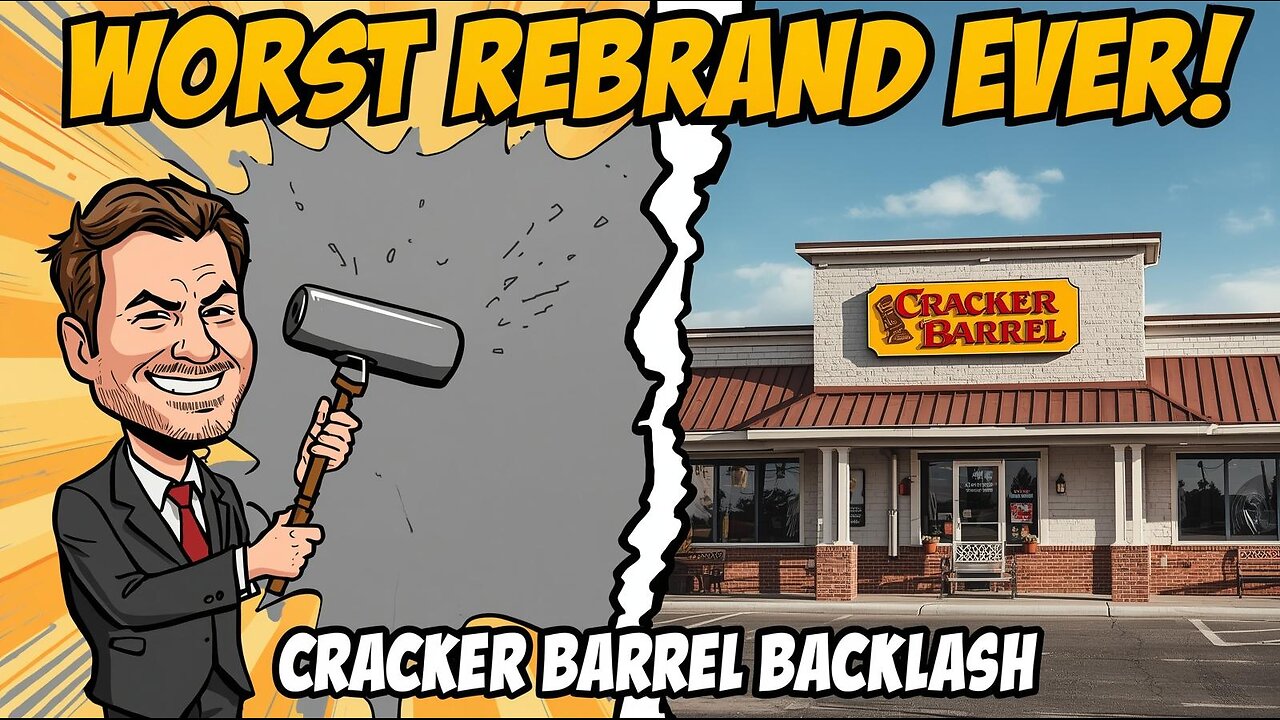
From Biscuits to Backlash: Cracker Barrel’s Branding Disaster
Cracker Barrel’s rebrand may go down as one of the worst corporate moves of all time. The iconic Southern restaurant tried to ditch its rustic, old-school look for a “sleek, modern” design—removing its legendary old man logo, stripping the walls bare, and turning cozy dining rooms into sterile waiting rooms.
The backlash? Immediate and brutal. Customers revolted, the stock tanked nearly $94 million overnight, and for once, America agreed on something: the new Cracker Barrel branding sucks.
But here’s the twist—after just one week, Cracker Barrel reversed course, brought back the old logo, and pretended like nothing happened. Was this incompetence… or a secret PR stunt?
In this video, The Critical Nerd breaks down:
👉 The history of Cracker Barrel and why its identity matters
👉 The disastrous rebrand and customer revolt
👉 Stock crashes, Trump’s response, and media coverage
👉 The quick corporate apology and rollback
👉 Whether this was the dumbest move ever—or brilliant marketing
🍗 What do you think? Drop a comment and let’s debate.
#CrackerBarrel #WokeFail #BrandingDisaster #CriticalNerd #BudLightMoment #CorporateMeltdown #TheCriticalNerd
-
 7:52
7:52
The Critical Nerd
12 days agoWoke University Declares LORD OF THE RINGS Racist — You Shall Not Pass Without a DEI Degree!
331 -
 LIVE
LIVE
Barry Cunningham
4 hours agoYOU'VE BEEN MISINFORMED! GREED IS ACTUALLY GOOD! ESPECIALLY NOW! (AND MORE NEWS)
2,629 watching -
 LIVE
LIVE
ThisIsDeLaCruz
12 minutes agoBack Stage Pass with Avenged Sevenfold
42 watching -
 LIVE
LIVE
Tundra Tactical
2 hours agoProfessional Gun Nerd Plays Battlefield 6
76 watching -
 1:01:12
Donald Trump Jr.
5 hours agoThe China Matrix with Journalist Lee Smith | TRIGGERED Ep.288
90.9K65 -
 LIVE
LIVE
MattMorseTV
1 hour ago🔴Trump's '60 Minutes' INTERVIEW + MUCH MORE.🔴
1,152 watching -
 LIVE
LIVE
Dr Disrespect
10 hours ago🔴LIVE - DR DISRESPECT - ARC RAIDERS - FULL SEND INTO THE RED
1,226 watching -
 1:02:08
BonginoReport
3 hours agoNicki Minaj Speaks Out Against Christian Persecution - Nightly Scroll w/ Hayley Caronia (Ep.169)
23.6K20 -
 LIVE
LIVE
SpartakusLIVE
4 hours agoSNIPING in Battlefield 6 - REDSEC || Monday MOTIVATION to CONQUER the Week
130 watching -
 LIVE
LIVE
Nerdrotic
2 hours agoNerdrotic At Night 531
329 watching