This AI Turns Raw Data Into Charts & Reports Automatically 📊 EP #316
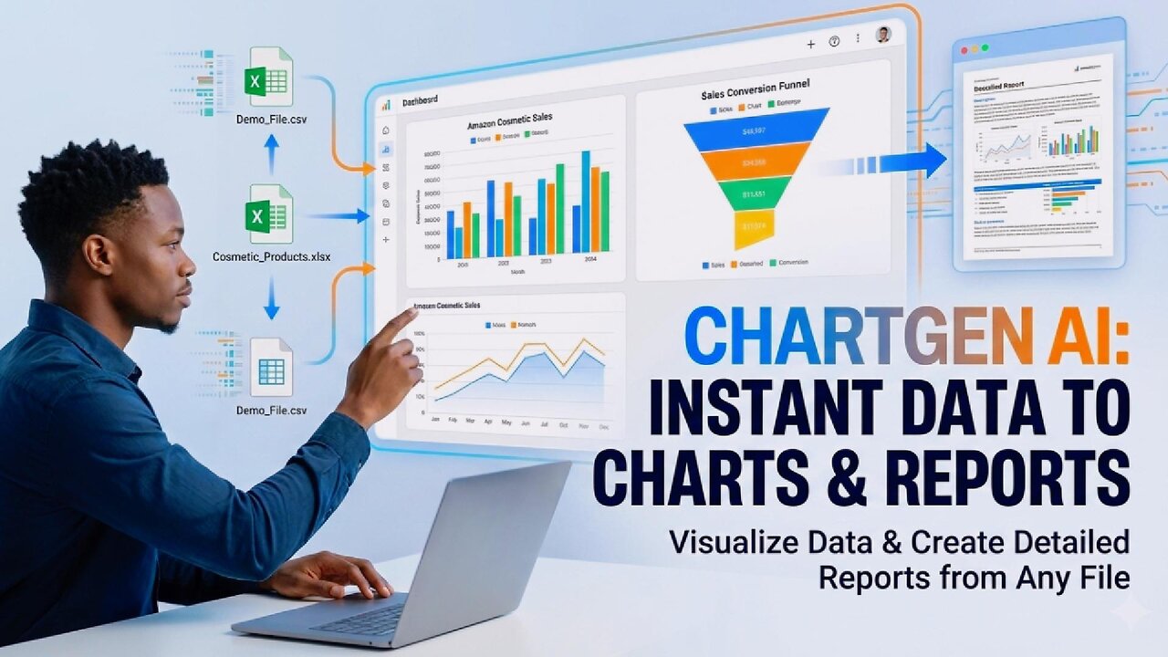
📊 Turning raw data into clear insights usually takes hours — cleaning spreadsheets, building charts, and writing reports. Chartgen AI automates that entire workflow by turning files, datasets, and URLs into visual charts and structured analysis reports in minutes.
In this video, I upload a real dataset and walk through how Chartgen AI processes the data, generates visualizations, and produces a full written report — step by step.
Here’s what you’ll get from this video:
✅ How Chartgen AI analyzes files and datasets automatically
✅ AI-generated charts, funnels, and visual breakdowns
✅ A full written data analysis report from raw data
✅ How to explore metrics interactively (hover, drill-down, compare)
✅ Export options: PDF, PowerPoint, web pages, and more
✅ Who this tool is best for (CTOs, analysts, founders, e-commerce teams)
If you work with spreadsheets, analytics, reporting, or dashboards, this tool can save you a huge amount of time by automating the boring parts of data analysis.
👉 Try Chartgen AI: https://chartgen.ai
👉 Get Perfecting Prompts
https://www.jayjohnson.co.uk/product-page/perfecting-prompt-a-7-day-ai-crash-course
🤖 Search through tools: https://www.frozenlight.ai/bot/everyday-ai-bot/
👉 Chat to ChatJPT: http://instagram.com/jayjohnsonofficial
🌐 Website: https://www.jayjohnson.co.uk/
This video is an AI walkthrough as part of our Everyday AI series. Subscribe to our channel to learn more about AI.
#ChartgenAI #DataVisualization #AITools #EverydayAI #analysis
-
 9:50
9:50
Everyday AI
4 days agoEveryone Will Have Their Own AI Company (Here’s Why)⚡ EP #363
-
 22:33
22:33
Welker Farms
1 day ago $7.29 earned$4,000 Leak? Let's Crack It Open & Investigate!
64.8K10 -
 20:42
20:42
Jasmin Laine
17 hours agoSupreme Court CANCELS Election Win—Liberal MP LOSES It After VIRAL Clip HAUNTS Him
40.5K68 -
 15:03
15:03
tactical_rifleman
1 day ago $7.17 earnedGriffin Armament MK2 Review
28.3K10 -
 4:56
4:56
Paul Joseph Watson
2 days agoThey Tried to Cover It Up... Now We Know Why
94.9K75 -
 12:03
12:03
Actual Justice Warrior
1 day agoLow IQ Criminal SNITCHES On HIMSELF
39K37 -
 57:01
57:01
Dialogue works
2 days ago $8.10 earnedMatthew Hoh: Is Netanyahu Pushing the US Into War With Iran?
47K18 -
 5:50:42
SLS - Street League Skateboarding
23 days agoSLS Sydney Men's & Women's Knockout Rounds | WATCH LIVE FEBRUARY 14, 2026 🛹
331K21 -
 2:07:35
FreshandFit
20 hours agoWhy Are Women Single This Valentines Day? w/ Jack Morgan RLP
107K78 -
 6:01:58
Akademiks
13 hours agoTI and 50 Cent Both Call each other RATS. Tony Yayo explains Ja Rule isnt like DAT! Brorilla up200k?
80.2K4